I was awarded the LRPS distinction (Licentiate of the Royal Photographic Society) in 2015.
There are a few ways of achieving this award, but the most common is to submit a ‘panel’ of 10 prints. The panel must be arranged (hung) in a pleasing way – in effect this arrangement is an 11th picture.
I chose 10″ x 8″ prints, in larger white card mounts. The prints look a little better than these digital images.
The Panel
You are allowed to display your pictures in two or three rows. I thought that this arrangement was pleasing, and it allowed me to display my mixture of portrait and landscape formats.
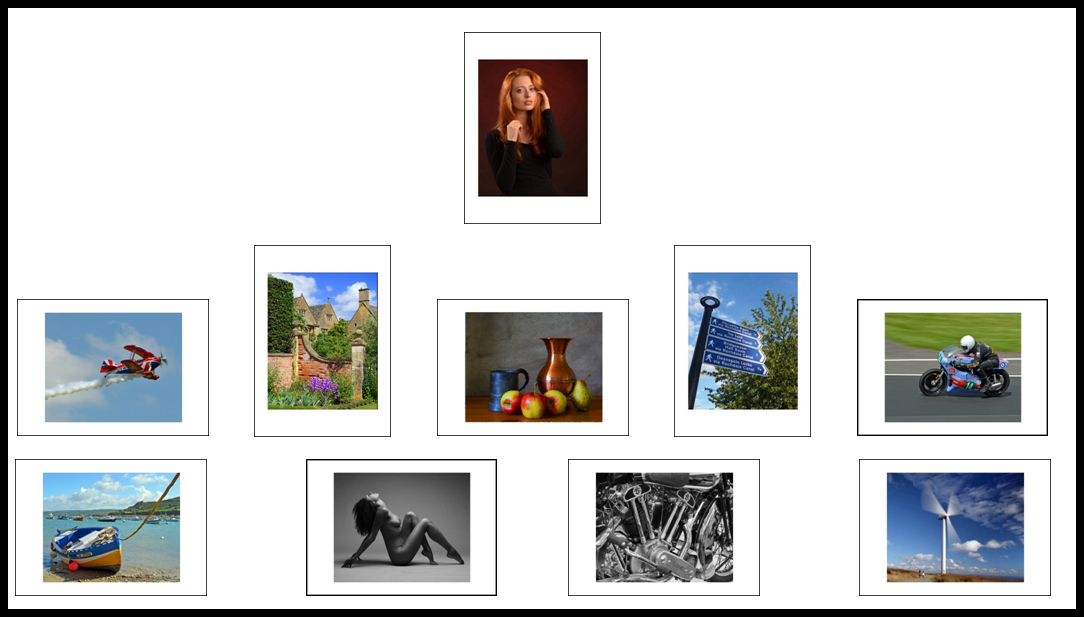
Redhead
It seemed like a good idea to have a stand-out portrait by itself in the top-centre. I’m pleased with the lighting, and especially with the pose, which took some working out.
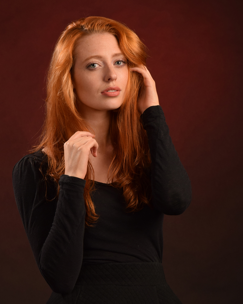
Pitts Special
I’ve been interested in aviation photography since I became a ‘serious’ photographer in 2012, so initially my panel was full of planes. However, for various reasons (mainly balance) I ended up with just one. The prop-blur and the ‘smoke’ trails give the picture a sense of movement
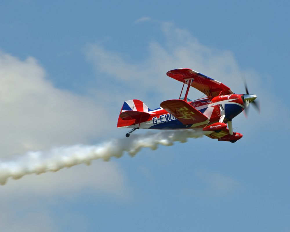
Cotswolds
Some may dismiss this a ‘Chocolate box’ picture – so what? I like the composure, and it’s a very pleasant photo – nice colours, good light etc.
Chardin

Jean-Baptiste-Siméon Chardin was a master painter of still-life subjects. This is my attempt to reproduce such a painting, with lot of care taken to get the composition, lighting and background right – and a little help from software. This was one of my reserves at the advisory day – and the advice I got was to include it in my panel! I think that the colour palette agrees with that of the Redhead above it.
Signpost
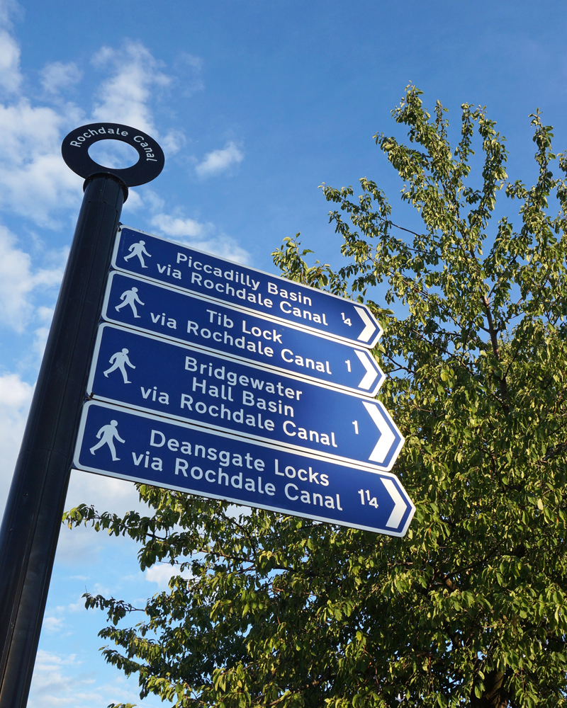
This is a simple image, but has plenty to involve the viewer.
Flat out
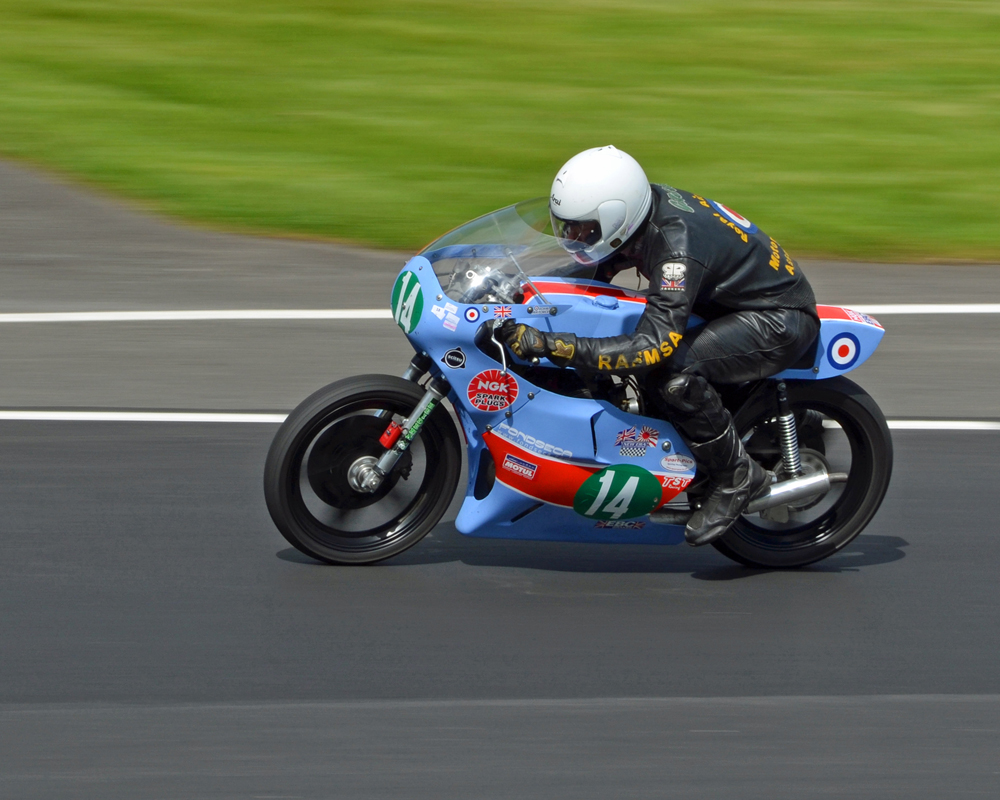
A nice coloured motorcycle, with what I think is good panning. This image nicely balance the Pitts special, both moving in to the panel.
Moored boat
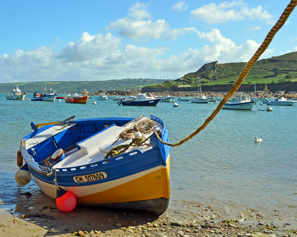
You can’t go wrong with images of wooden boats – either they are characterful wrecks, or colourful and attention-grabbing like this one. I got my feet wet getting the shot, but it was worth it!
Art Nude
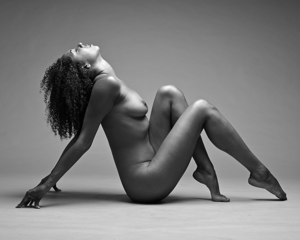
I’ve always liked monochrome images – sometimes colour can detract. I love the subtle tone in this image. Another point of the image was to add a little variety to the panel.
A Superior Motorcycle
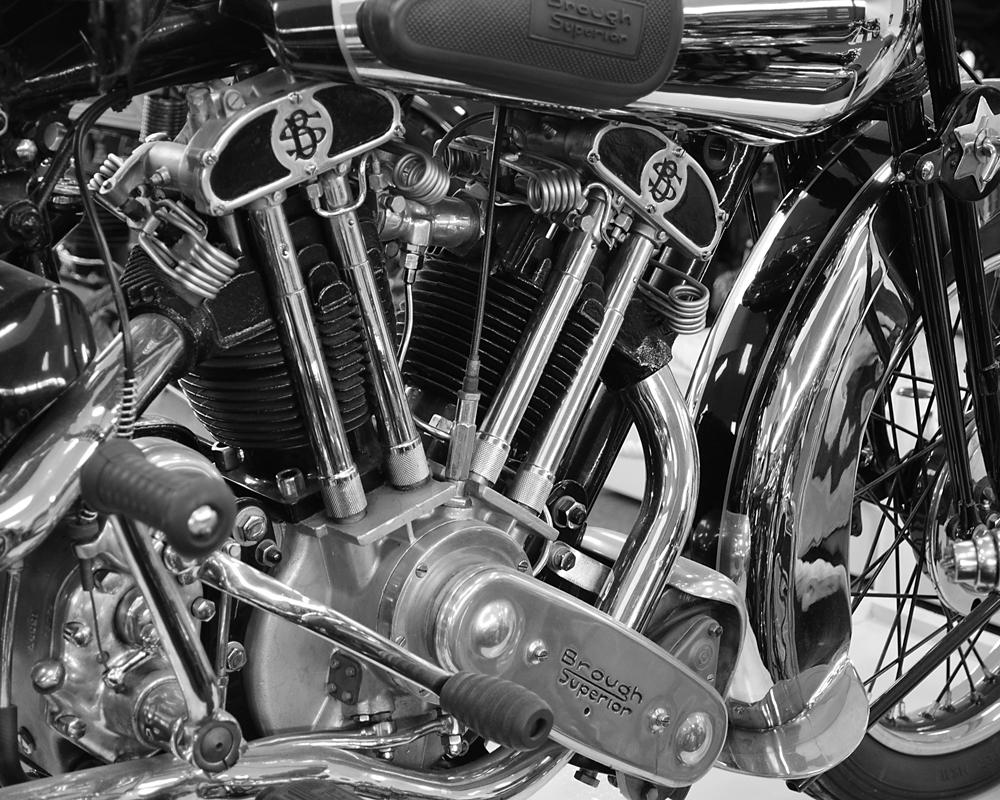
This image is a pair with the Art Nude study. Where the Art Nude has nice subtle tones, this image is much harder. The two are linked by the ‘V’ shapes seen in both – this image was actually the inspiration for the model’s pose in the Art Nude.
A Windy Day
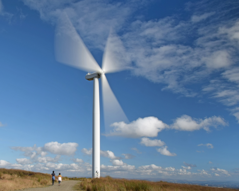
This is earliest image in the panel – it was something I’ve wanted to have a go at for some time. Getting the blur on the turbine blades required some ND filters – happily the people in the image were walking slowly, and directly away from the camera, so they aren’t noticeably blurred. I wanted to contrast / compare this image with the prop blur on the Pitts Special.
Coming soon…
Well, not very soon at all really. I’m starting to think seriously about the ARPS distinction. I’ve got the inspiration, all I need is some decent snaps! Watch this space.